Responsive web design for everyone
I once worked on a website with an interesting responsive web design strategy, and I later gave a talk at work about what I learned from it. This post is the written version of that talk.
But first, what do I mean by responsive web design?
Responsive web design is the approach of adapting a web page's content to a variety of environments, ensuring good usability.
By environment I mean a combination of device, screen size, browser font size and page zoom. This definition is adapted from Wikipedia's, and the last two parts are the ones most often forgotten.
The strategy: scale everything with vw
The website used the vw unit (viewport width, where 1vw is 1% of the screen width) to scale the whole website. Imagine this: you have 2 designs, mobile (designed at 375px width) and desktop (designed at 1440px width). Screens narrower than 768px get the mobile design, and the rest get the desktop design.
Within each design, everything scales with the screen width. A 400px screen (a bit wider than the 375px mobile design) shows the mobile design scaled up a bit, and a 1200px screen (a bit narrower than the 1440px desktop design) shows the desktop design scaled down a bit.
To scale, every size is converted to vw with the rule of three. If the mobile title has a font-size of 36px, and 375px is 100vw, then 36px is 9.6vw (36 × 100 / 375):
/* Mobile design, 375px wide */
.title {
  font-size: 9.6vw; /* 36px at 375px */
}

/* Desktop design, 1440px wide */
@media (min-width: 768px) {
  .title {
    font-size: 2.5vw; /* 36px at 1440px */
  }
}
The same goes for every other size (margins, paddings, etc). So we just need 2 designs, a breakpoint to switch between them, and the screen width. That's it.
Note: On very wide screens (e.g. wider than 2000px), sizes stop growing and the website is centered, so it doesn't get scaled up so much that it's hard to read.
Very practical, right? Unfortunately, this approach has three flaws:
- Things can look too small (or too big)
- Page zoom doesn't work
- Browser font size is ignored
Let's unpack each one, and then see how to fix them.
Things can look too small (or too big)
Problem: Things can get too small to read or to press. For example, on an 800px screen (desktop design, but close to mobile), text designed at 14px (at 1440px) is scaled down to about 7.8px, totally unreadable:
@media (min-width: 768px) {
  .text {
    font-size: 0.97vw; /* 14px at 1440px, but 7.8px at 800px */
  }
}
The same happens to buttons and links. WCAG recommends a hit area (the area you can press or click) of at least 44 × 44px, but a 44px button designed at 1440px shrinks to about 24px at 800px, which is hard to press, especially on touch devices.
It also works the other way around: on a 767px screen (still the mobile design), the 36px title grows to about 74px.
Reason: vw is strictly tied to the screen width.
Page zoom doesn't work
Problem: Pressing Cmd + +/- on Mac (Ctrl + +/- on Windows and Linux) should make the content bigger or smaller. Maybe the text on a website is a bit too small for you, so you zoom in. Or you want more content to fit on the screen (maybe to take a screenshot), so you zoom out. But with vw, page zoom has no effect.
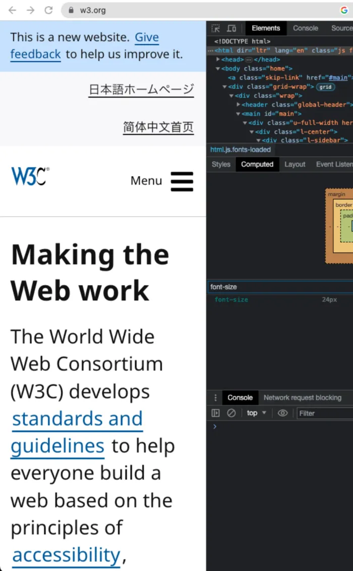
And it matters, especially for people with low vision: WCAG asks that text can be resized up to 200% without losing any content or functionality (Resize Text, level AA). This is what it should look like, on w3.org:
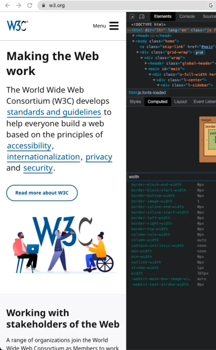
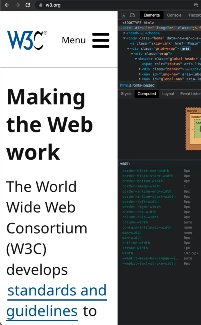
Reason: Browsers measure everything in CSS pixels, an abstraction over the screen's physical pixels. On a standard screen at 100% zoom, 1 CSS pixel is 1 physical pixel. High density screens, like Apple's Retina displays, have smaller physical pixels, so there 1 CSS pixel already takes 2 × 2 physical pixels.
Page zoom changes that ratio. At 200% on a standard screen, 1 CSS pixel takes 2 physical pixels, which is why things look bigger. But the viewport (the visible area of the page) goes the other way: a screen 1000 physical pixels wide is now only 500 CSS pixels wide (like the w3.org page above, going from 365px to 182.5px). Since vw is a percentage of that width, the two effects cancel out:
| Zoom | Viewport width | 2.5vw in CSS pixels |
Physical size |
|---|---|---|---|
| 100% | 1000px | 25px | 25px |
| 200% | 500px | 12.5px | 25px |
Zooming in can still switch from the desktop to the mobile design (500px is below the 768px breakpoint), so sizes might jump, but within each design, page zoom does nothing.
Note: Page zoom is not the same as pinch zoom (on a trackpad or a phone). Pinch zoom works like a magnifying glass on top of the page, so it does enlarge vw content, but then you have to scroll sideways to read each line, instead of the content reflowing to fit the screen.
Browser font size is ignored
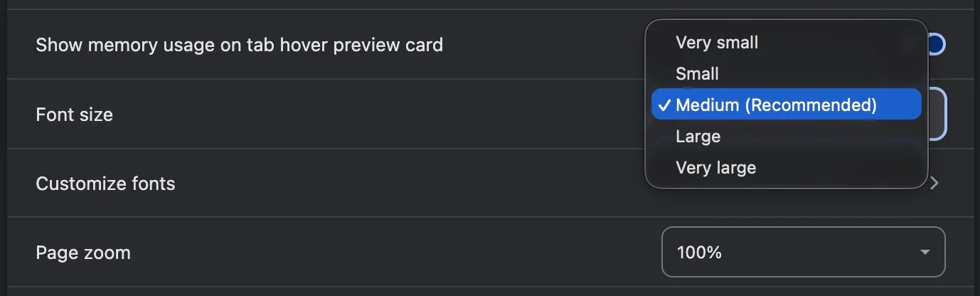
Problem: A lesser-known browser feature is changing the default font size. In Chrome, go to Settings → Appearance → Font size, and you can choose between "Very small", "Small", "Medium" (the default), "Large" and "Very large":
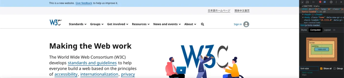
Websites should follow it, at least for text, like w3.org does:
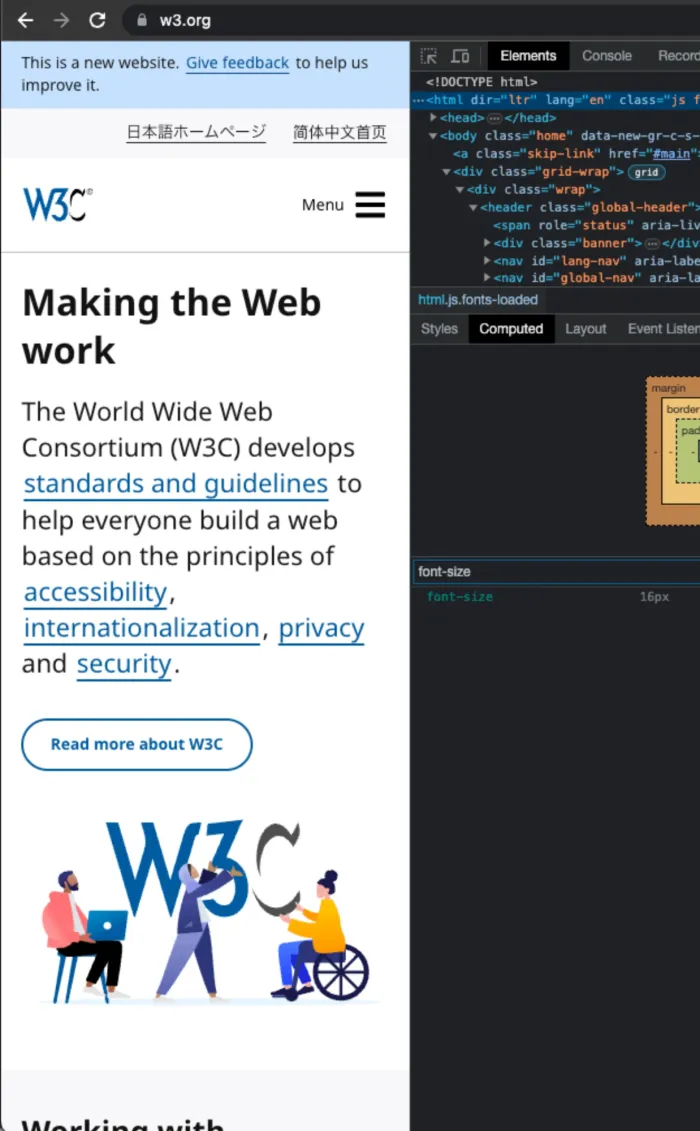
But with vw it has no effect, so a user who changed it to suit their needs is ignored.
Reason: The browser font size sets the font-size of the html element: 16px for "Medium", 20px for "Large" and 24px for "Very large". Sizes in vw (based on the screen width) or px (absolute) are not linked to it.
The solution: use rem
Use rem instead of vw for text and controls. rem (meaning "root em") is relative to the font-size of the root, or in other words, the html element. So it follows the browser font size, and like any other unit (except viewport units), it also grows with page zoom.
What about px? It fixes the first two flaws, as it's not tied to the screen width and it grows with page zoom. But it doesn't fix the third one: 16px text stays 16px whatever browser font size you choose.
| Unit | Independent of screen width | Follows page zoom | Follows browser font size |
|---|---|---|---|
vw |
No | No | No |
px |
Yes | Yes | No |
rem |
Yes | Yes | Yes |
To keep the link with the browser font size, don't override the font-size of html:
/* Don't: ignores the browser font size */
html {
  font-size: 16px;
}

/* Do: 100% of the browser font size. It's also what browsers do by default, so you can leave it out */
html {
  font-size: 100%;
}

/* And size things in rem (1rem is 16px by default) */
.title {
  font-size: 2.25rem; /* 36px */
}

.text {
  font-size: 0.875rem; /* 14px */
}

.button {
  min-width: 2.75rem; /* 44px */
  min-height: 2.75rem;
}
Since nothing scales anymore, you need a new strategy for different screen widths: the content has to reflow. Text wraps onto more lines, cards stack, navigation changes form, etc. It's more work, but the website becomes much more usable.
Spacing (margins and paddings) should also grow "responsibly", so rem is a good default there too, but using vw or vh for some spacing isn't such a big deal. And for buttons, what matters is the hit area: a small icon can sit inside a bigger button, as long as the icon is still big enough to see and understand.
Breakpoints: use em
We usually think of media queries in terms of mobile, tablet and desktop, but as Josh W. Comeau puts it, it's "more helpful to think in terms of available space". When the text gets bigger, there's less space for the content, even if the screen stays the same size. For example, w3.org switches to its mobile design when the browser font size is "Very large", instead of growing the menu items until they wrap:
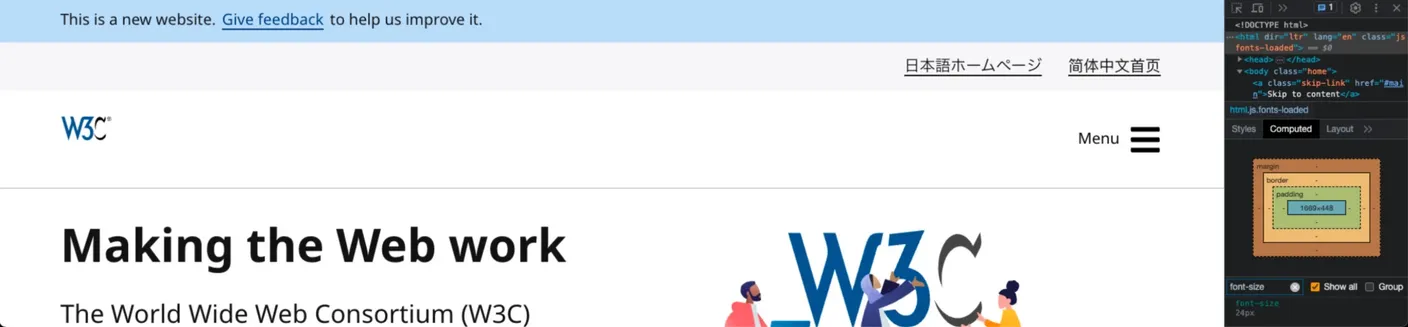
Media queries can follow the browser font size too, by using em instead of px:
/* 768px with the default browser font size, 960px with "Large" */
@media (min-width: 48em) {
  /* Desktop design */
}
In media queries, em is always based on the browser font size, not on the font-size of html. So when someone chooses a larger font size, the breakpoint moves with it. With "Large" (20px), 48em becomes 960px, so a 900px wide screen gets the mobile design, which has more room for the bigger text. With 768px, the desktop design would have to fit 25% bigger text in the same space.
Note: Why em and not rem? In theory they behave the same in media queries, but older versions of Safari handled rem differently (Barry Peng explains the bug), so em is the safer choice.
Try it yourself
You can check any website (including yours) in a few minutes:
- Page zoom: zoom in up to 200%. Text should grow, and content should reflow without being cut off or overlapping.
- Browser font size: in Chrome, go to Settings → Appearance → Font size, and choose "Very large". Text should grow.
- Screen width: resize the browser window from wide to narrow. Content should reflow, not shrink.
Conclusion
There's more to responsive web design than units, but these three habits go a long way:
- Leave the
font-sizeofhtmlas is (no overriding) - Use
remfor anything that should follow page zoom and browser font size, especially text and controls - Use
emfor media queries
This way we're closer to having a responsive web design for everyone!
Further reading
- WCAG 2.1: Understanding Resize Text
- WCAG 2.1: Understanding Target Size
- MDN: Responsive design
- web.dev: Responsive web design basics
- web.dev: Accessible responsive design
- Penn State Accessibility: Font size on the web
- Wikipedia: Responsive web design
- Josh W. Comeau: The Surprising Truth About Pixels and Accessibility
- Barry Peng: Why you should not use rem in media queries